alert--smallalertarchive--smallarchivearrow-left--smallarrow-leftarrow-right--smallarrow-rightblock--smallblockcalendar--smallcalendarcamera--smallcameracheck--smallcheck-circle--smallcheck-circlecheckchevron-down--smallchevron-downchevron-left--smallchevron-leftchevron-right--smallchevron-rightchevron-up--smallchevron-upclock--smallclock-arrow--smallclock-arrowclockcog--smallcogconversation--smallconversationcopy--smallcopycreditcard--smallcreditcardcross--smallcross-circle--smallcross-circlecrossdownload--smalldownloadedit--smalleditexport--smallexportexternal-facebookexternal-facebookboxedexternal-flickrexternal-gmailexternal-instagramexternal-linkedinexternal-mediumexternal-messenger-outlined--smallexternal-messenger-outlinedexternal-outlookexternal-tumblrexternal-twitter-outlined--smallexternal-twitter-outlinedexternal-twitterexternal-yahooexternal-youtubefilter--smallfilterfolder--smallfolderglobe--smallglobegroups--smallgroupsheart--smallheart-outline--smallheart-outlinehearthide--smallhidehome--smallhomeinfo--smallinfoinvite--smallinvitelaunch-new-window--smalllaunch-new-windowlink--smalllinklocation-pin--smalllocation-pin-slashed--smalllocation-pin-slashedlocation-pinlocation-services--smalllocation-serviceslock--smalllockmail--smallmailmeetup-m--smallmeetup-mmessages--smallmessagesminus--smallminusnotifications--smallnotifications-badged--smallnotifications-badgednotifications-mute--smallnotifications-mutenotificationsoverflow--smalloverflowphoto-album--smallphoto-album-add--smallphoto-album-addphoto-albumplus--smallplus-circle--smallplus-circleplusprofile--smallprofilepulse--smallpulserefresh--smallrefreshreply--smallreplysearch--smallsearchsend--smallsendsent-messages--smallsent-messagesshow--smallshowstar--smallstartextblock--smalltextblockticket--smalltickettrash--smalltrashupdates--smallupdates

Typography

All of the metrics in Swarm Design System are based in our typography and our typographic scale. Text is the most common way information is displayed in Meetup’s products, so we’ve developed a polished typographic system that provides hierarchy and ensures our content is always readable.


Family

Graphik is our primary typeface. It has a variety of weights, adapting to different environments while keeping the voice of Meetup consistent. At the same time, it’s bold and strong to complement our script logo and bold color pallette.
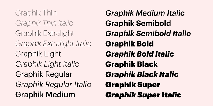
Graphik type spec


Weights


Colors

By default, text uses the Primary text color. For example: body copy and page titles

Text that calls for less visual hierarchy uses the Secondary text color. For example: captions, and text field labels

The quietest and lowest priority text uses the Hint text color. This text color should be used for content that serves as an enhancement, so only use this for content that’s “nice to know”, not “need to know”. For example: Text field placeholders, disabled content, and hints of course.

Give feedback

If this page is missing something or if you'd like to make an edit, you can:

  • open a PR in the Swarm Design System repo
  • file a ticket in JIRA
  • send us a message in the #design-systems Slack channel in Meetup's Slack team
Meetup home

Last updated Jan 01 2018, 6:00 PM